(Well, for me, at least. But I’m super excited, so I want to dive into this process that I just tried out today.)
Hi, everyone! This is another blog post where I talk about my drawing process a little, because I found a new shading method that I love, and I need to talk about it.
Lighting and shading is one of those digital art things I struggle with fairly often, mainly because there are so many ways to do it. I’ve found in my years of trying new things that I always end up going back to cel shading. I just love how easy it is to do, and how cartoony it looks and it doesn’t make my line art disappear like more detailed shading often does (at least when I do it).
What made me keep going back to the more blended, soft shading look is that I was having a hard time making my cel shading look interesting. It always looked a little dull, to me, at least. So, yesterday, I sat down, watched a couple YouTube tutorials, and took notes so that future me would remember.
This morning, I decided to put those techniques I learned to the test. Not long after I got up, I did a sketch in my sketchbook. I scanned it (using the VERY HANDY Google Drive scanner on the Android version of the app. This was my first time using it). And I was ready to start inking it in Clip Studio Paint.

Now, let’s get into the shading process.
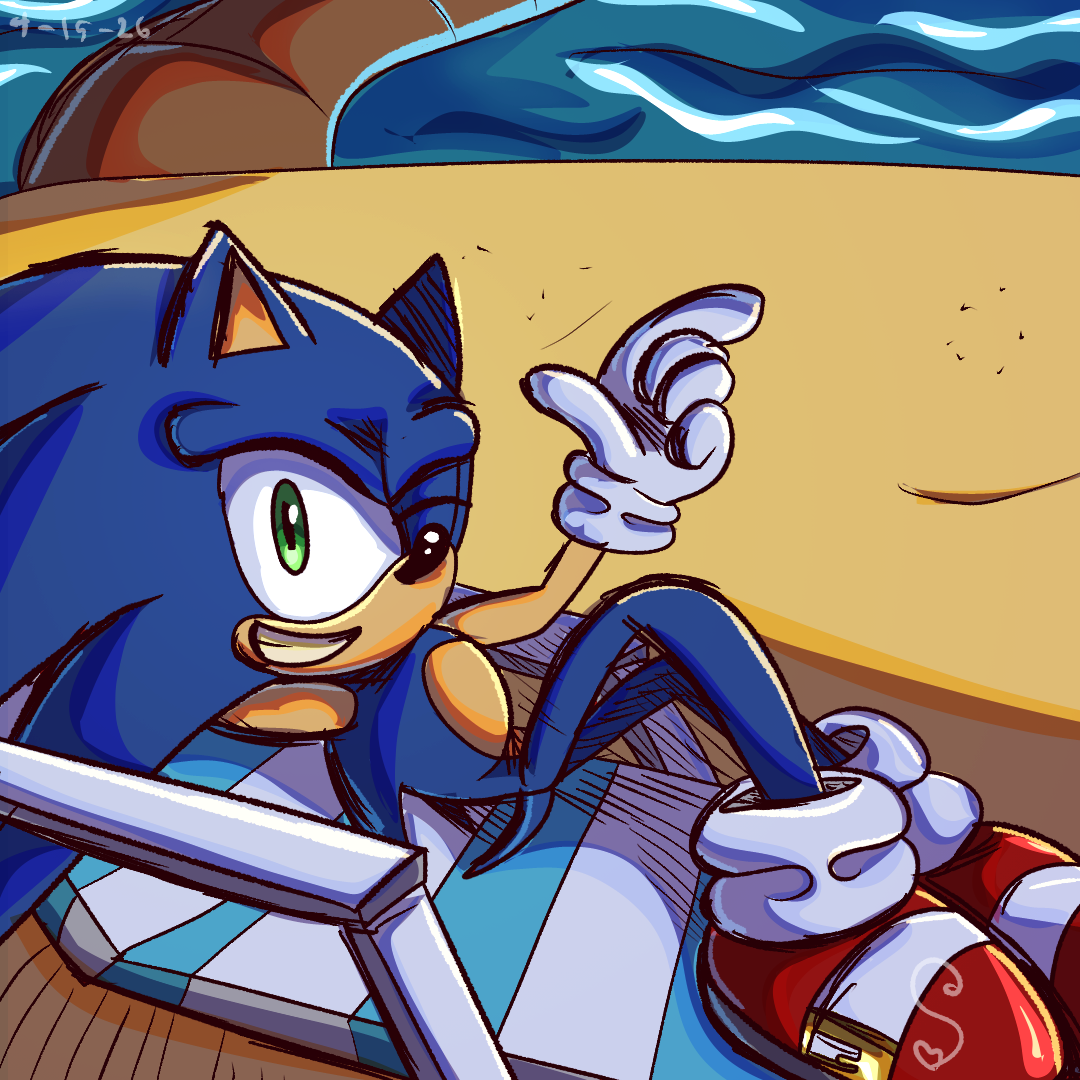
The Base Colors

After I finished inking, I did the base colors, as usual. I always do my base colors on one layer, because I don’t like having a million different layers. And I use the fill tool, so it’s very easy to do it that way.
Though to fill in areas where there are random blank pixels (because that ALWAYS happens with the fill tool), I use the Adjust Line Width tool (it’s under the vector Control Point tool, if you don’t know), turn the brush size up so it’s huge, and run it over my color layer a few times, until there aren’t any noticeable gaps near the lines. If there’s a lot of open space around the character (like if they sky’s going to be visible, because I put that on a separate layer), I select all that blank space, invert the selection, and then use the Adjust Line Width tool.
(Not sure how well I explained that, but, hopefully, I got the point across. I just thought I’d bring it up because so many artists struggle with that when it comes to the fill tool).
I generally try to keep my base colors pretty saturated, because I love very bright and vibrant colors. But, for this part, I don’t make the saturation crazy. I usually stay near the middle of the color picker, leaning more towards the saturated end of the spectrum than gray. Also, obviously, since these are the mid tones, I don’t want them to be too dark or light either. But that mostly applies to black and white, in my opinion. It’s just generally a good idea to make your whites a very light gray and your blacks a very dark gray.
Shading

This right here is how I’ve always done my cel shading. Just using a multiple layer clipped to the base layer, and having everything be a dark purple (sometimes pink, if I want it to look warmer). For this step, I use the Lasso Fill tool in Clip Studio. I love it for doing shading, because you literally just select an area, and it automatically fills it. It makes it very easy and quick!
Shadow Outlines

This is the new part of my process! It’s based on the idea of sub-surface scattering, where I add a more saturated color along the edges of my shadows. I do this all on an overlay layer, and still using that Lasso Fill tool. I just trace shapes along the edges of each shadow, changing the color depending on what the base color is. Make sure that your outline overlaps the shading a little, because that adds even more variation. It just looks really cool, and adds a lot of saturation and depth!
Highlights

I didn’t go too crazy with the highlights. Drawing on a screen layer, I mostly just added them to the shiny surfaces, like his shoes, his eyes, and the water in the background. I used the Lasso Fill tool once again for these. For most of them, I started with just a lighter version of the base color, and then added a tiny bit of pure white on top to make it look really shiny.
Reflective Light

This is the one step where I didn’t use the Lasso Fill tool. I just used the same pen brush that I use for my line art for this step. On a hard light layer, I just carefully outlined the areas where I wanted reflective light. Blue highlights are on the edges of the shaded areas, because it’s reflecting the blue from the sky (and probably the water, too). On the opposite side, I added some yellow highlights to show the sunlight. For that tree trunk back there, you can see that I switched to a more aqua blue to show the water reflecting off of it.
Outro
And, there you have it! I’ve been wanting to do a post about my coloring process for a long time. Really, ever since I’ve started doing these not-comic-related posts. And I felt like today would be a good time to do it, because I have a feeling this is going to be my main digital coloring process for a long time. I’m sure it will still change occasionally, obviously as I get better at this technique, and whenever I’m in the mood to do something more painterly. Because that’s one of the great things about art. You never need to stick to just one style. You can just do whatever you feel like doing that day.
I hope you enjoyed this post, and maybe even found it a little helpful. Thanks for reading!